Changing spatial inequality across the GCR
-
- Date of publication: 01 July 2014
- Download map


This month’s map of the month depicts mean income per ward as a percentage of the mean income for Gauteng, comparing 2001 and 2011. The average income per ward was derived from StatsSA Census data from 2001 and 2011, and then compared with the mean income for Gauteng as a whole. A ward with a mean income below that for Gauteng has a value of less than 100% (red to orange colours on the map). Wards with values above the Gauteng mean have values greater than 100% (yellow to dark green). This analysis, based on percentage divergence from the provincial mean, simplifies the picture that results from using different income bands across the two censuses.
The mean income percentage maps clearly illustrate changing spatial inequality across the GCR. Poverty (in this case areas below Gauteng’s mean income) is concentrated in the previous apartheid townships (such as Soweto, Tembisa and Mamelodi) and in the rural wards on the fringes of the city-region. Encouragingly, a lot of these areas — for example KwaThema, Orange Farm and Soshanguve — are becoming relatively less poor over time, indicating a trend of lower relative spatial inequality. Darlington Mushongera’s recent calculation of a Gini coefficient for Gauteng (using the same 2001 and 2011 Census data) seems to confirm this slight decline in inequality, with the Gini dropping from 0,76 in 2001 to 0,74 in 2011.
However, the maps also suggest that it is excess wealth in the hands of the few, not poverty, which is driving continued high inequality. Wealth concentrates in the central core of the province, with the wealthiest wards located in the heart of Johannesburg’s northern suburbs such as Sandton, and pockets in Tshwane. The maps suggest the need for deeper research into spatial inequality in the GCR, particularly after the emphasis newly elected Premier David Makhura has placed on an agenda of 'spatial transformation' in recent speeches.


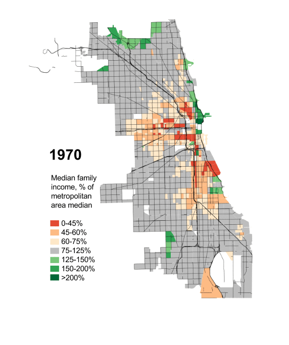
Acknowledgements to Daniel Hertz whose interactive mapping of Chicago’s spatial inequality inspired this analysis.
danielkayhertz.com and danielhertz.files.wordpress.com/2014/03/incseggif.gif